Skyland Guardian
A mobile guardian-style game set in a floating-island world — teaching teens financial literacy through portfolio allocation, market events, and an AI investment coach.

The Brief
We had 7 days to answer one question: why would a teenager care about compound interest?
The NextGen AI Hackathon, presented by 3D Wealth Platform and NUVC.ai, challenged teams to design an AI-powered, gamified investment learning platform for teens aged 12–18. The brief was clear: existing investment education tools are either too technical, too adult-oriented, or entirely detached from how teenagers actually think and make decisions. This gap leaves an entire generation without accessible, safe, or motivating ways to build financial literacy.
The real challenge wasn't the technology. It was psychology: how do you create intrinsic motivation to learn something that won't feel relevant for years?
"Financial literacy is a cornerstone of future independence, yet traditional methods rarely engage younger generations."
Why Traditional Financial Education Fails Teenagers
Quiz-based financial literacy apps assume teenagers already want to learn. They don't. Classroom-style modules assume attention spans that teenagers don't have for optional content. And real investing platforms — even paper trading ones — carry either real risk or adult complexity that immediately alienates the target user.
We needed a format that taught portfolio diversification and market response through doing, not reading. That made failure feel safe and even fun. And that was compelling enough to choose over TikTok for ten minutes a day.
Why a Card Game, Not a Quiz
We explored three formats in our first day: a quiz game, a virtual stock market simulator, and a card-based allocation game. We ruled out the quiz format because it rewards memorisation, not judgment. We ruled out a realistic stock simulator because it overwhelmed our target age group with real financial terminology before they had any emotional framework for it.
The card game model won because it maps directly to the mental model we wanted to teach: every allocation decision has a consequence, and consequences are shaped by forces outside your control.
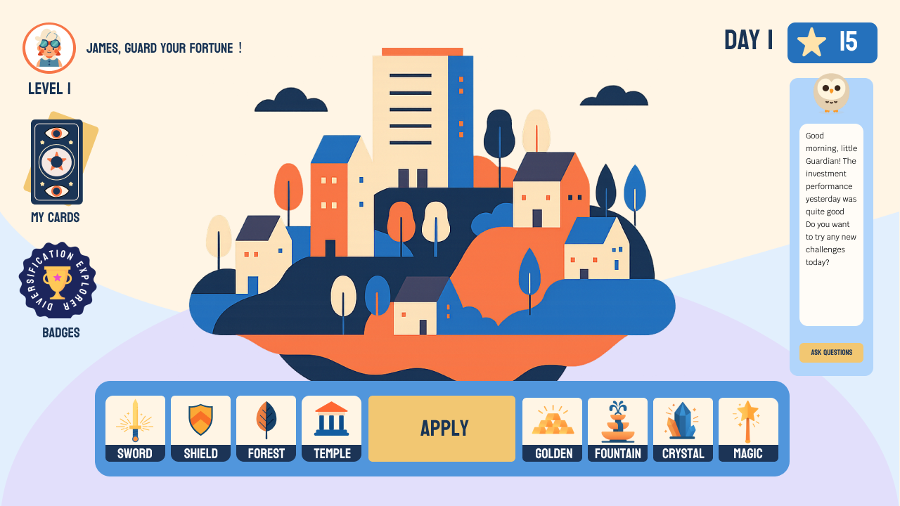
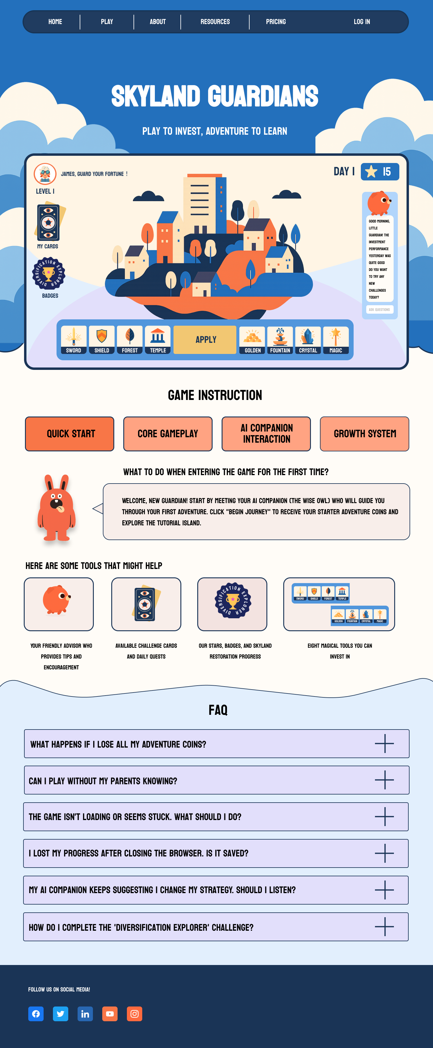
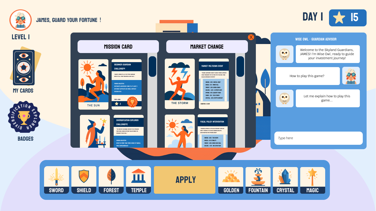
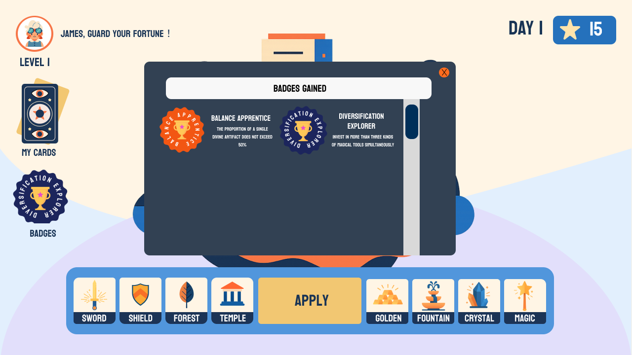
The artifact system was a deliberate abstraction layer. Rather than calling them stocks and bonds, we named them: Agile Sword (technology), Solid Shield (bonds), Green Forest (ESG), Golden Temple (gold), Fountain of Stability (stable assets), Mystic Crystal (crypto). By removing the real financial labels, we removed the intimidation and the perceived stakes — while preserving the underlying logic of diversification, risk, and return.
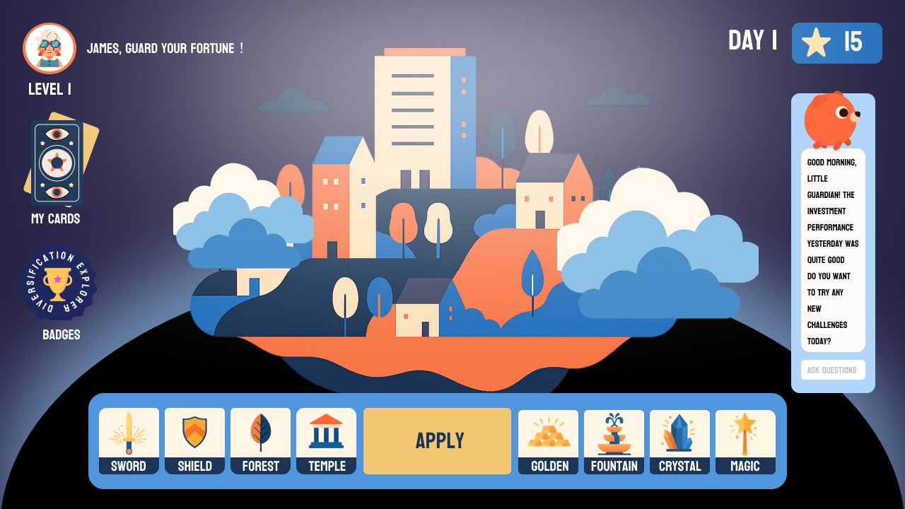
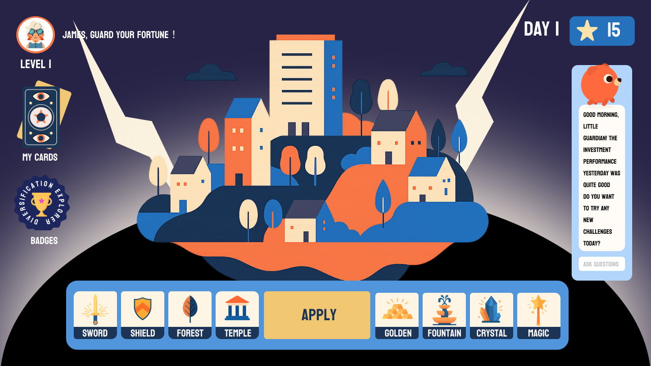
The market state system mapped economic conditions to environmental metaphors teenagers can feel before they understand analytically: Sunshine (stable growth), Fog (uncertainty), Storm (volatility). The player experiences the emotional register of a market condition before they can name it — building intuitive market sentiment that transfers to real financial understanding later.
The Constraint We Didn't Have Time to Build
Designing financial products for minors introduces complexity beyond UX. It sits at the intersection of consumer protection law, parental consent requirements, and the ethics of teaching risk-taking behaviour to users who cannot legally bear financial risk.
From the outset we identified a core tension: the game needed to feel autonomous and empowering for the teenage user, while simultaneously requiring adult oversight by legal and commercial necessity. Our monetisation model — parent-funded explorer coin top-ups, not direct child spending — was a direct response to this constraint. Parents maintain financial control while their child experiences the full consequence of their own allocation decisions.
The critical feature we scoped but could not execute within the 7-day timeline was the Parent Dashboard: a synchronised view allowing parents to monitor their child's portfolio, set which artifacts are available, control coin limits, and approve special requests. This wasn't a nice-to-have. It was architecturally central to the product's legal viability and its commercial pitch to parents as the paying stakeholder.
The person who uses the product and the person who pays for it are different people — and designing for both is not optional.
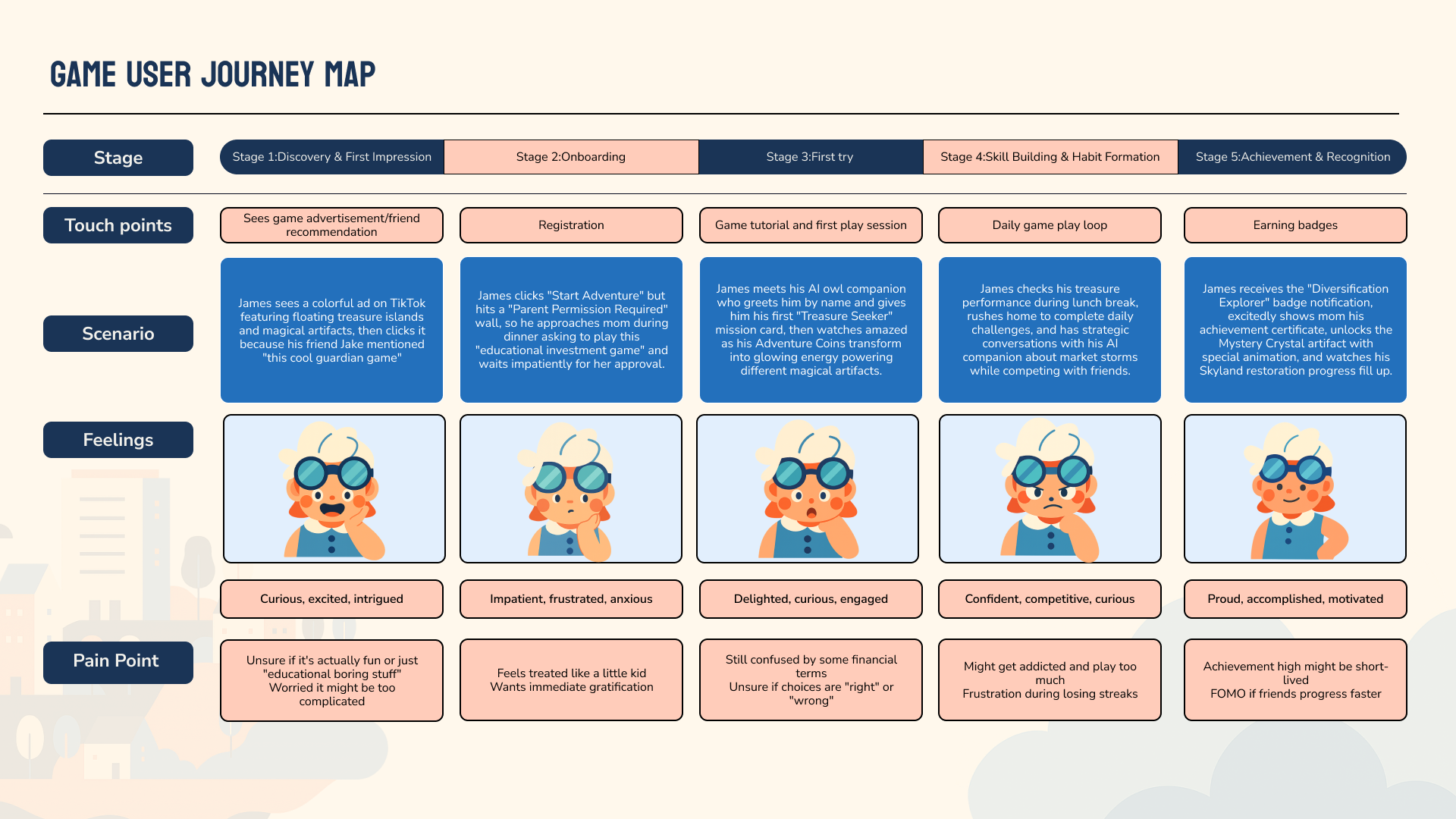
Understanding James
James isn't a fictional character. He's a synthesis of the pain points we identified for our core demographic: a 14–16 year old who responds to social validation, competitive mechanics, and visible progress — and who has zero tolerance for anything that feels like homework.
The most important design insight came at the onboarding stage. James hits a "Parent Permission Required" wall. This friction point is intentional — it's the legal necessity described above. But it creates a real UX challenge: how do you design a permission flow that doesn't kill a teenager's enthusiasm? Our solution was to frame parental approval not as a gatekeeping barrier but as a shared adventure kick-off. The copy reads "Get your guardian's blessing to begin your quest." The notification to parents is framed as an invitation, not a compliance form.
The Design
Designing for commercial reality
The stakeholder we didn't have time to fully design for was the parent — yet the parent is the paying customer. Any real-money transaction for a user under 18 requires parental consent in most jurisdictions, which means the monetisation model had to flow through parents, not children.
We scoped the Parent Dashboard as a core system component: a synchronised view allowing parents to monitor in-game portfolio performance, track mission progress, set artifact restrictions, and control coin top-up permissions. This wasn't just a feature — it was the legal foundation of the product's commercial viability, and the reason a parent would feel comfortable funding their child's explorer coins.
Due to the 7-day hackathon constraint, the Parent Dashboard was not built for final submission. But the architectural decisions in our IA already account for the parent layer — it would be the first thing built in a next sprint.