Back
Dashboard Design · Telehealth · App Design

Onco

A cross-device medical imaging support system — bridging the gap between remote cancer patients in rural Australia and the specialists they can't easily reach.

Role UX Designer & Visual Designer
Team 4 members
Duration 3 months
Year 2025
Award Best Capstone Project — Monash University
Onco hero image

The Problem Worth Solving

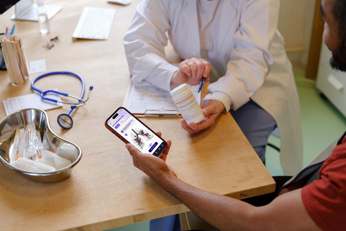
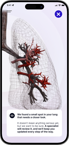
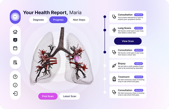
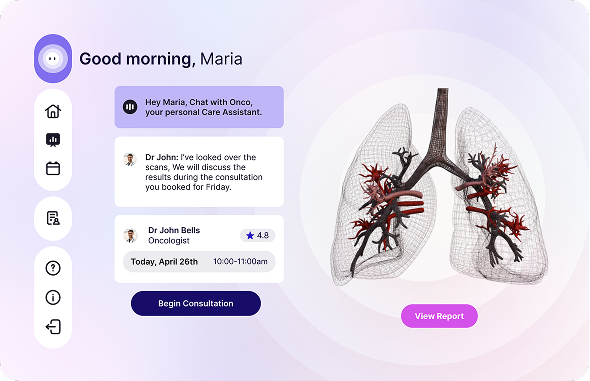
In rural South Australia, the nearest cancer specialist can be a six-hour drive away. Imaging equipment is concentrated in major city hospitals. When Maria — a 55-year-old woman from a remote farming village — receives a scan result, she often can't understand it, can't easily reach her doctor to ask questions, and has no way to track her treatment progress between appointments.

This isn't a rare edge case. Rural cancer patients in Australia face significantly longer wait times and lower five-year survival rates than their metropolitan counterparts. We were briefed by a real client stakeholder to explore how a digital platform could close this gap — not by replacing clinical care, but by giving patients like Maria more agency and continuity within it.

A note on scope: Onco was developed as a concept project in direct response to a real client brief. All design decisions were made against genuine clinical constraints and evaluated by our client partner.

Who We Designed For

We identified two distinct user groups whose needs are interdependent: the patient who needs clarity and emotional reassurance, and the oncologist who needs efficiency and reliable data. Designing for one without the other would break the system.

Primary Target User — Patient
Patient Persona — Maria
Meet Maria
Background

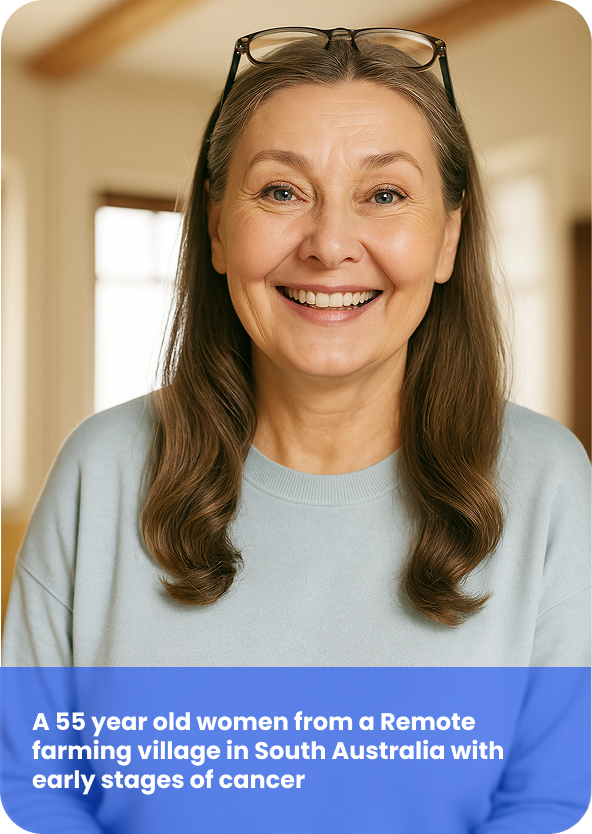
Has 3 kids between 12–24, 2 older being daughters and youngest a son. Lives with extended family, where they all work in the farm to make a living. Health condition: She is suspected to be an early-stage lung disease. There is a history of lung cancer in the family.

Her Needs
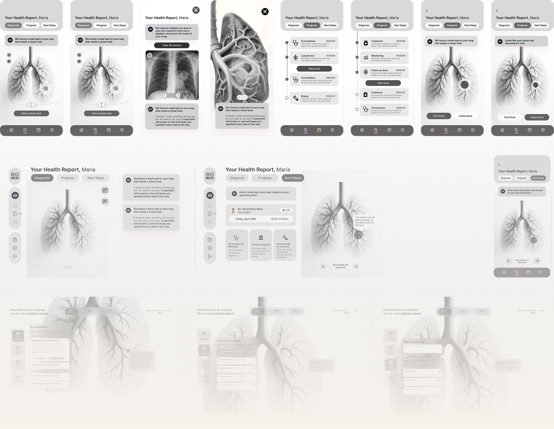
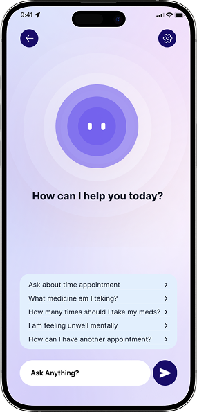
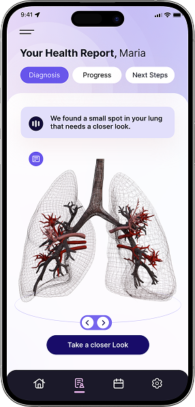
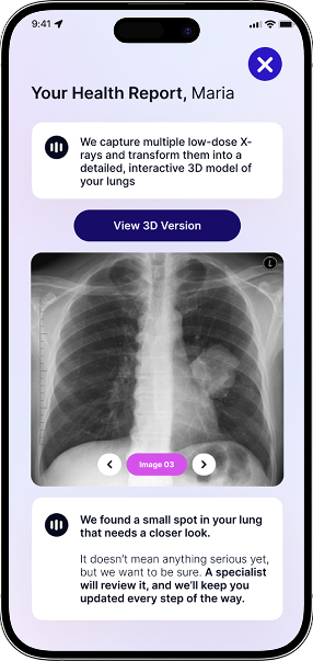
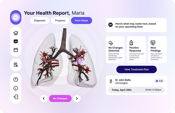
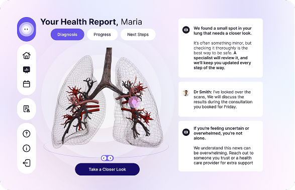
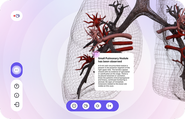
  • A clear and understandable way of presenting medical images
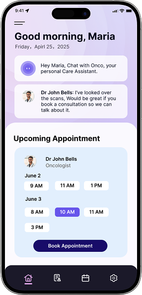
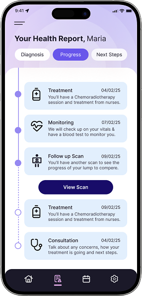
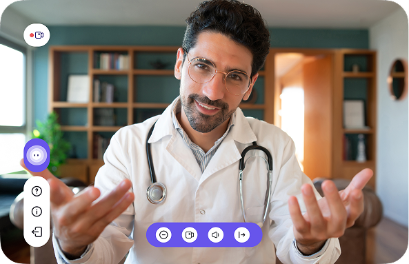
  • Maintain a remote communication channel with the doctor
  • Receive continuous reminders and psychological support during the treatment process
Challenges
  • Limited access to specialised care (nearest hospital is a six-hour drive)
  • Fear of complex medical procedures and unfamiliar medical imaging
  • Need for clear, understandable health information
Secondary Target User — Oncologist

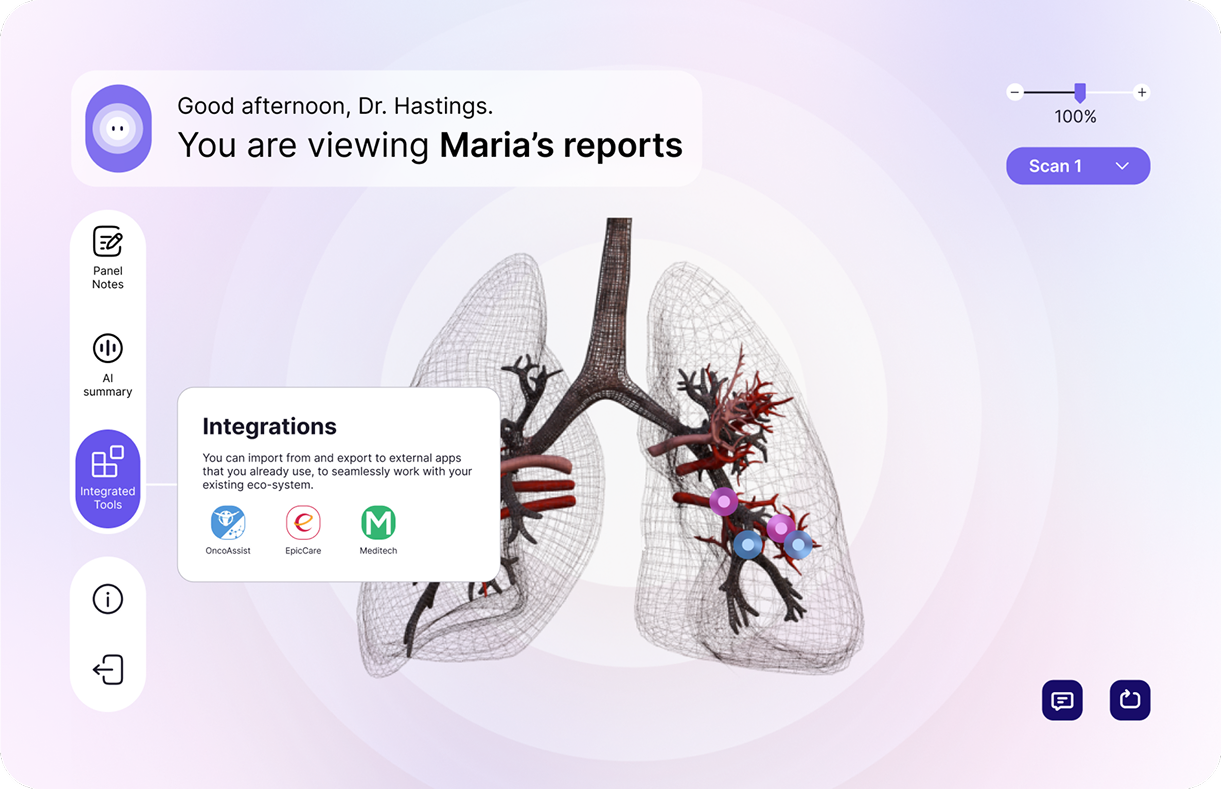
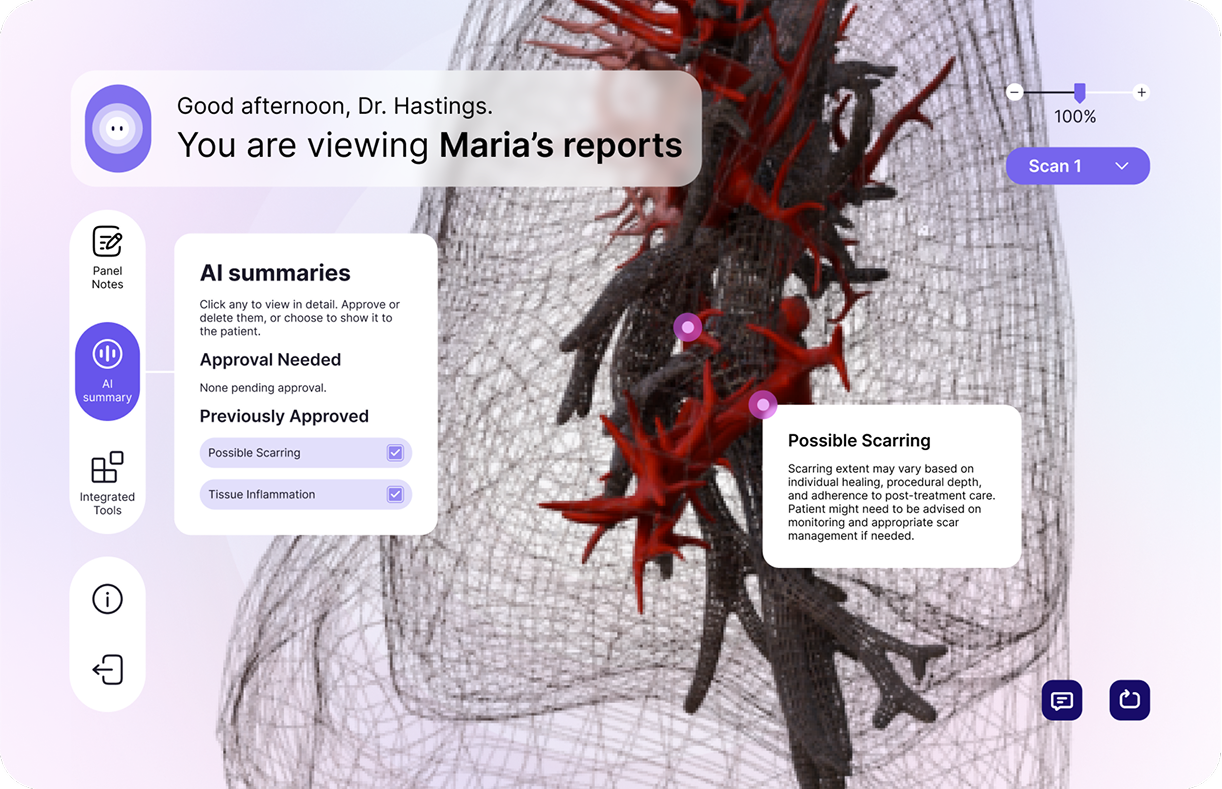
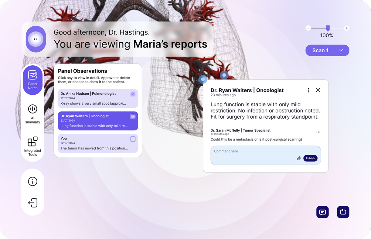
Be responsible for image interpretation, formulating treatment plans and following up on the patient's condition. At present, communication is often poor due to geographical restrictions and system fragmentation. A tool that can be quickly integrated into AI analysis, annotated images, and collaborate with other systems is needed.

Our Design Approach

Decision 01
Why two interfaces, not one?
Our initial brief focused on the patient app. But in early design explorations, we quickly realised that a patient-facing tool without a corresponding clinical interface would fail: if Maria can see her scan but her doctor doesn't know she's looking at it, the communication gap remains.
Decision 02
Why AI summary, not direct doctor notes?
Doctor time is the scarcest resource in rural healthcare. We designed the AI summary layer not as a replacement for clinical judgment, but as a first-pass translation of complex scan language into accessible terms — reducing the communication burden on both ends. The doctor approves and modifies before the patient sees it.

The Design

Information Architecture
Onco app
Log in
Home page
Calendar page
Log symptoms
Report page
Diagnosis
Appointment
Next step
Progress
Chatbox
Onco dashboard
Synchronise to
Home page
Notes panel
AI summary
Integrated tools
Onco patient dashboard
Home page
Consultation page
Report page
Diagnosis
Next step
Progress
IA · Three connected layers — Onco App / Onco Dashboard / Onco Patient Dashboard
Wireframes
Onco wireframes
Design System
Onco Logo Dark Onco Logo
Onco Logo Onco Logo
Onco icon set
48px Display
32px Heading
24px Subheading
16px Body — the quick brown fox jumps over the lazy dog
12px Caption / Label
E2DFFB
B6AEF2
8A7FE9
2620B8
17125B
DDEDFC
A60DF8
72B4F3
4099F0
000000
F6D6FB
EAA45F
DF75E7
D349E0
FFFFFF
Patient App · Home Page
App Home 01 App Home 02
Home Page · Scan status and next appointment surfaced within 2 seconds of opening.
Patient App · Report Page
Report 01 Report 02 Report 03 Report 04
Report Page · Complex imaging results translated into plain language the patient can understand and act on.
Doctor Dashboard
Doctor Dashboard Doctor Dashboard 1 Doctor Dashboard 2
Synchronized report data viewable by both patient and doctor in real time.
Patient Dashboard · Report Page
Dashboard Report 01 Dashboard Report Dashboard Report 1 Dashboard Report 2
Report Page · Doctor annotates AI-assisted scan analysis and controls what information is pushed to the patient app.
Doctor Dashboard · Consultation Page
Consultation 01 Consultation 02
Consultation Page · Live video consultation with remote specialists, directly linked to the patient's scan data.
Business Context

Designing for commercial reality

If Onco were to pursue a real-world go-to-market path, the most viable model would be B2B2C: licensed to hospitals or regional health networks, who then provide access to patients as part of their care pathway. This removes the friction of patient acquisition and aligns with how healthcare technology is actually procured in Australia. Understanding this shaped how we prioritised features — anything that reduced administrative burden on the clinical side was treated as a priority.

What I Learned

What worked
The dual-interface structure — designing patient and doctor views as a connected system — was validated by our client stakeholder as the most clinically realistic aspect of the concept.
What I'd do differently
We spent too much time early on the speculative future framing and not enough on information architecture. I'd prioritise IA testing with real users before visual design.
What this taught me
Healthcare design is not about making things pretty. It's about reducing cognitive and emotional load at the exact moment when a person is most scared. That constraint made me a better information designer.
Next project
Skyland Guardian